
As stats and studies indicate, visual cues help us better retrieve and remember information. Since our brain processes visual images more easily as compared to words, visuals have an edge over text.
We are naturally drawn to colors, contrasting patterns, typography, textures and shapes used in emails and otherwise. But there is one more thing that matters a lot in emails- the position, orientation and size of the visuals.
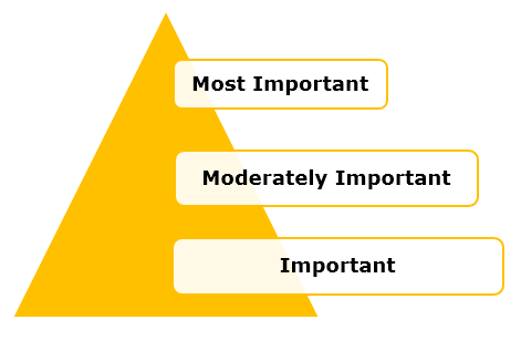
A GLIMPSE INTO VISUAL HIERARCHY FOR EMAILS
Understanding how the visual pattern works, designers and marketers have been working around the term -‘Visual Hierarchy’. This is the process of organization and prioritization of content or images in a way that it draws a step-by-step attention to the most important factor or feature in the email – enabling your information to be scanned and understood easily.
Here, prioritizing the information is extremely crucial. As shown in the image below, visual hierarchy is like a pyramid – with the most important elements placed at the top (in larger and bolder fonts) the information is gradually aligned as per its importance, as you go down.
As an email marketer, it becomes a challenge to grasp leads not only because of the increasing competitions (with brand marketers trying every trick in the book), but grabbing the attention of your subscriber is nonetheless a task too.
Visual hierarchy can be of great help here. Patterns observed in the typography, colors, font size, placement, etc. of the email decide the attraction quotient of your email.
To know if you’re actually doing things right, the best method marketers swear by is the “squint test”.
Yes, it’s exactly what the name suggests. All you have to do is just sit back from your computer screen so that the visual is completely and clearly visible, then squint at your design so that all the details blur and you just see what STANDS OUT (It’s actually pretty awesome!).
If you’re pleased with what you see and want your subscribers to see exactly that, then you’re good to go ahead with it – if not, give your email template a new design.
Play around with colors, contrasts, textures, shapes, positions, orientation, and sizes. Getting all these elements in order can give your subscribers an idea of what is the highlight of your email.
Here’s a great email by InVision in which they have used visual hierarchy aptly. Have a look!

- The email highlights the important information in a bright pink color.
- Overall, it’s a simple and minimal email with the necessary information in place.
- You can see the flow of the information in terms of an inverted triangle- with general information at the top the message is narrowing down towards a CTA.
Let’s check out another example of great visual hierarchy. The footwear brand TOMS has some amazing emails that are aesthetically perfect and pleasing to the eyes.

- It’s a simple, to-the-point email with a beautiful hero image. However, since the entire content is in an image form, having contrasting alt tabs is a great way in case the image is not rendered.
- The headline is catchy and the use of typography makes the email look very attractive.
- The CTA tabs stand out and make their purpose clear.
- You can try the squint test here and see how well the CTAs and title stand out, grabbing maximum attention.
HERO IMAGE – YOUR SUPERPOWER
A major role in attracting and grabbing the attention of the subscriber is also played by the hero image within your email. This image is often the first visual your subscriber encounters and it encapsulates the overview of the most important content.
A hero image mainly consists of image and text. It can be static or dynamic depending on the brands and their preferences. Lately, many brands have been seen playing around with GIFs, videos and cinemagraphs in their hero images.
Here’s a stunning example from the luxury fashion brand Burberry, which has been playing around with its promotional emails and has brought together beautiful and catchy GIFs and Videos apart from static images within their hero image.
-
GIF in Hero Image

-
Video In Hero Image

Let’s take a look at a cinemagraph email by Mr. Porter, a global online retail destination for men’s style. Here’s a glimpse of it.
 HERO IMAGE BEST PRACTICES
1. Use HD Quality Images
Make sure to use good HD quality images for your hero image. Since it’s the first thing a subscriber sees once the email is opened, it tends to make an impact and say a lot about your brand.

2. Must Appeal & Connect
The hero image must appeal and connect with your brand and products. At the same time, the designs, contrasting colors, typography, etc. must stand out and connect with subscribers as well. Having relevant information that engages the subscriber is also very important.

3. Emphasize on the CTA
Most static hero images tend to have at least one CTA in a contrasting color. This is a great way to have the CTA above the fold in your email since it can really help in conversions and increase click-through rates.

4. Play Around With Designs
If you’re thinking of trying something new apart from GIFs, cinemagraphs or static images as your hero image, then illustrations are your best bet. They connect instantly and give a peppy feel to your email.


WRAPPING UP
With time the perceptions of people and marketers alike have changed. Visuals now speak for themselves and with the email marketing world constantly improving and experimenting with their visuals, email designs have evolved.
If you wish to send such stunning visuals to your subscribers, We have been working on some amazing designs for emails and we’d love to chat about them with you!
Kevin George
Latest posts by Kevin George (see all)
Interactive Elements- Email Client Support & Fallback Strategies
Mailable Microsites IV: How Travelocity Started Counting on Countdown in Email